Amazon's Android app is getting a much-needed UI update - Android
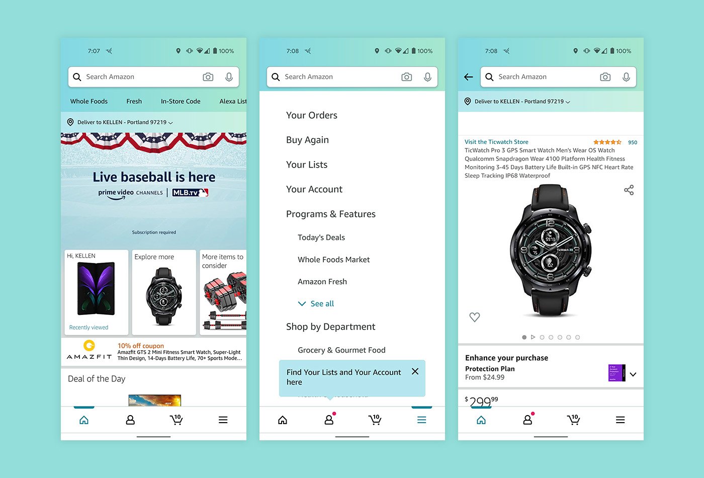
Amazon's redesign is long overdue.
What you need to know
- The Amazon app has been spotted with a redesigned UI.
- The new UI features a bottom bar navigation for easier access to different tabs.
- The updated UI has been available on iPhones for some time but is starting to show up on Android phones.
Many people have opinions about the Amazon app, and rarely are they positive. The app is functional and does everything you could need it to do, but the layout leaves a lot to be desired. A new UI has already been on iOS for some time, but it seems Android devices are finally getting the chance to experience it, according to Droid-Life.
With the updated UI, the Amazon app finally rids the hidden sidebar menu and adopts a bottom navigation bar. Different tabs are present on the bar for the home screen, your account, your cart, and the menu. It's a much-improved experience and makes it easier to access the most important app elements, especially now that many of the best Android phones are becoming larger and harder to use one-handed.
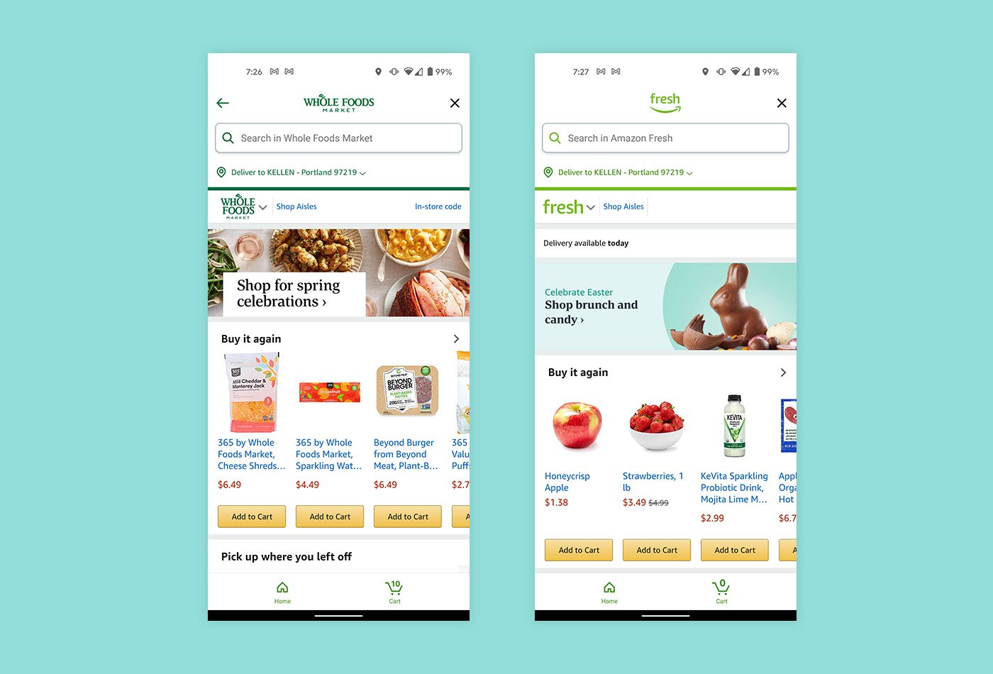
The new UI also spills over to the Whole Foods and Fresh sections of the app, including the font change, which brings larger text in certain app elements. These sections also appear much more differentiated than before, with more prominent branding and color schemes. This makes Whole Foods and Fresh feel like their own separate apps and gives an overall cleaner look.
It's unclear if the new UI is tied to a Play Store update or a server-side switch, but it should be rolling out on Android devices so keep checking if you haven't received it yet. So now you can start enjoying the new app experience while you head over to Amazon to purchase the new OnePlus 9 or OnePlus 9 Pro!
02/04/2021 01:01 AM
VIP-SCDkey Promo - Windows 10 PRO OEM Key $15 and Office 2016 $41!
02/04/2021 12:08 PM
Android phones sold in Russia now required to preinstall Russian-made apps
02/04/2021 09:12 PM
Here's Your Best Look At The Unreleased OnePlus Nord SE
02/04/2021 01:11 PM
'Fantasian,' from the creator of Final Fantasy, arrives on Apple Arcade
02/04/2021 11:40 AM
The Chromebook Video Player Is About To Get A Whole Lot Better
02/04/2021 11:07 PM
This Chromebook Bug Could Reveal Your Location Data But There's A Fix
02/04/2021 12:31 AM
Official Xbox Series X mini fridges are coming
02/04/2021 05:21 PM
- Comics
- HEALTH
- Libraries & Demo
- Sports Games
- Racing
- Cards & Casino
- Media & Video
- Photography
- Transportation
- Arcade & Action
- Brain & Puzzle
- Social
- Communication
- Casual
- Personalization
- Tools
- Medical
- Weather
- Shopping
- Health & Fitness
- Productivity
- Books & Reference
- Finance
- Entertainment
- Business
- Sports
- Music & Audio
- News & Magazines
- Education
- Lifestyle
- Travel & Local
