Android 12 DP2 Removes Light Blue Hue From Settings Menus - Android
One of the things that arrived (somewhat surprisingly) with Android 12 DP1, was the colors for settings menus, and that seems to have been removed in Android 12 DP2. To be clear there was really only one color for the settings menus, although more potential colors were speculated. The color that was present was a [...]
Read More...
The post Android 12 DP2 Removes Light Blue Hue From Settings Menus appeared first on Android Headlines.

One of the things that arrived (somewhat surprisingly) with Android 12 DP1, was the colors for settings menus, and that seems to have been removed in Android 12 DP2.
To be clear there was really only one color for the settings menus, although more potential colors were speculated. The color that was present was a light blue hue that could be seen across virtually every single settings screen. It was a noticeable blue tint. Which suggested that Google was experimenting with making the settings menus and other system screens more fun and colorful.
But perhaps that won't be the case. Since Android 12 DP2 has removed the blue tint from settings, other colors may not be in the cards after all.
Fun settings colors are nowhere to be found in Android 12 DP2
So far, it certainly seems like Google is setting up the design of Android for a very distinct change in the looks department. Not so much so that Android becomes unrecognizable from past versions. But enough that it seems clear to long-time users Google has shifted the aesthetics.
As discovered by Android Police, where fun colors like the blue tint used to exist in the menus, there are now some very muted and much less exciting off white backdrops. The blue tint was also present in the quick settings drop-down menus. Both in light and dark themes as well.
But as noted the light theme blue tint is now more of an off white. And the dark theme simply looks like more of a very dark gray.
The color tints could always come back
As is common with developer previews, things get removed and added back. That doesn't mean that Google will ever reintroduce these lightly colored system menus and screens.
But that also means there's a chance that it could. Whether that be in a later developer preview or one of the betas. Or even the final release of the software. The point is if you enjoyed this small change, keep an eye out for a return later.
With Android 12 DP2 having just released this morning, there are likely to be more small changes to Android popping up too. Both changes from the first developer preview version and from Android 11.
One such example is the capability to stash picture-in-picture videos. A change that surfaced with this morning's release. There were also some light changes to the one-handed mode of the UI.

The post Android 12 DP2 Removes Light Blue Hue From Settings Menus appeared first on Android Headlines.
17/03/2021 09:49 PM
The original 'Star Wars - Clone Wars' and 'Ewoks' are coming to Disney+
17/03/2021 03:23 PM
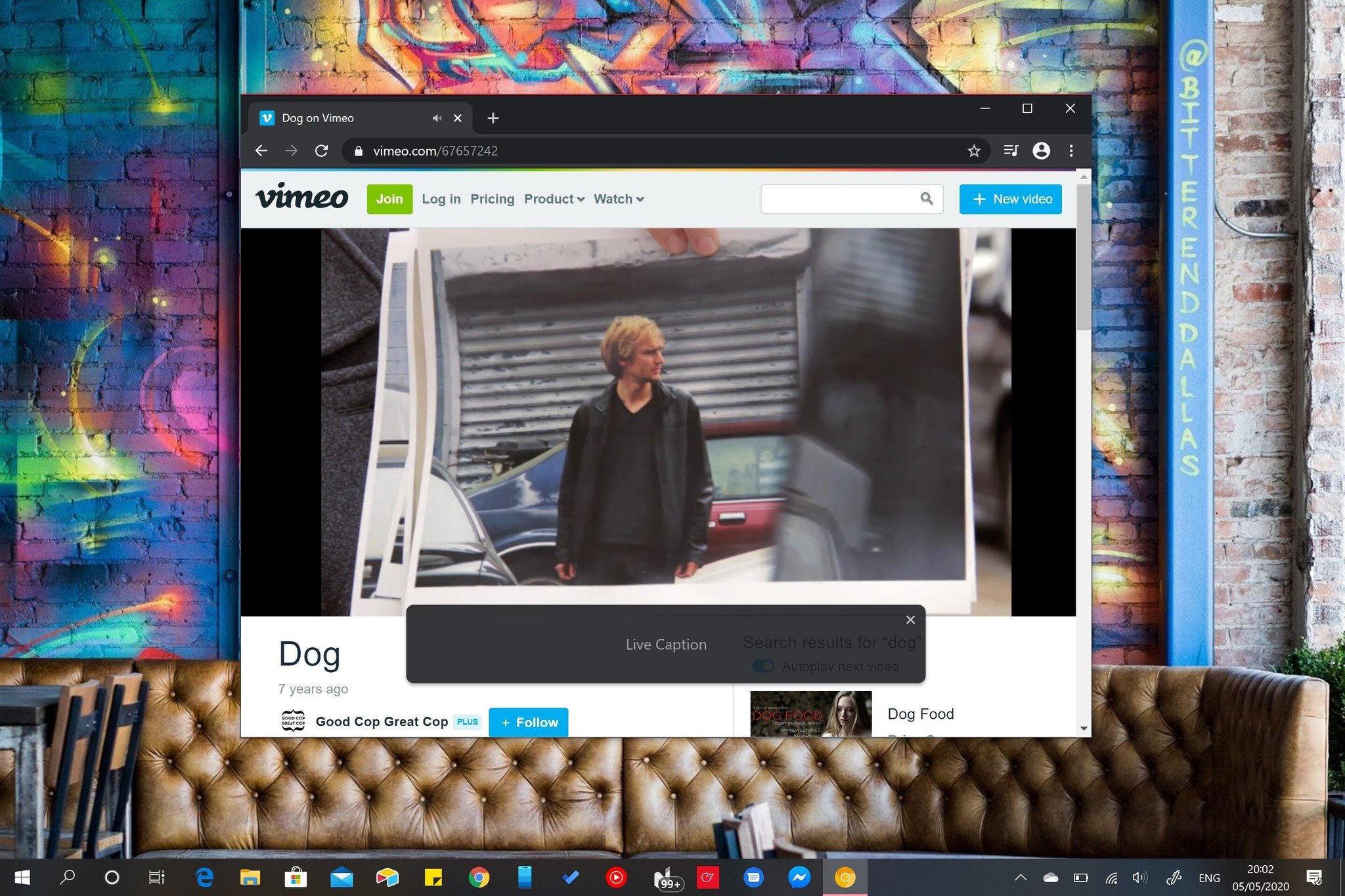
Google's Live Caption is now rolling out to Chrome on desktop
17/03/2021 02:54 PM
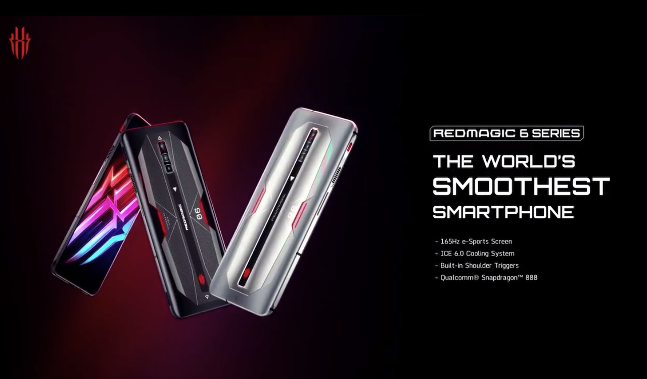
RedMagic 6, RedMagic 6 Pro will be up for pre-order soon
17/03/2021 05:45 AM
Should you buy the Garmin Vivoactive 4 or Samsung Galaxy Watch Active 2
17/03/2021 05:00 PM
Utah considers bill that would install anti-porn filters on new phones
17/03/2021 11:55 AM
The latest Android 12 developer preview includes improved picture-in-picture
17/03/2021 06:00 PM
New report highlights just how little iPhone and Android users care about 5G
17/03/2021 01:11 PM
- Comics
- HEALTH
- Libraries & Demo
- Sports Games
- Racing
- Cards & Casino
- Media & Video
- Photography
- Transportation
- Arcade & Action
- Brain & Puzzle
- Social
- Communication
- Casual
- Personalization
- Tools
- Medical
- Weather
- Shopping
- Health & Fitness
- Productivity
- Books & Reference
- Finance
- Entertainment
- Business
- Sports
- Music & Audio
- News & Magazines
- Education
- Lifestyle
- Travel & Local


