Google built Android 12, but Samsung will make it look and feel better - Android

Android 12 on my Pixel just isn't my style, but manufacturers like Samsung can fix everything.
It's opinion time, and one that people might not agree with — I hate how Android 12 looks on my Pixel phone. The giant menu list items, the chonky controls, the animations, all of it. It's definitely the Google Pixel look and style, but everything seems very out of place to me. I think it all ruins the bright (yeah, I am not a dark mode kind of guy) and minimalistic feel to Android that Google gives us on its Pixel phones.
I know Android 12 isn't nearly finished and by the time it comes out of testing and beta phases it could change, but I doubt it will. And I'm not throwing shade at the Pixel experience team here. It's their product and they get to do whatever they like with it, but this time it just happens to be, well, goofy. At least I think it's goofy, YMMV.
If you don't feel what I'm saying here, that's cool. Different strokes and all that apply. If you have no idea what I'm talking about and have the Android 12 DP on a Pixel phone, open the settings menu and scroll to the top. Then keep scrolling and watch that ripple wave animation. Boing.
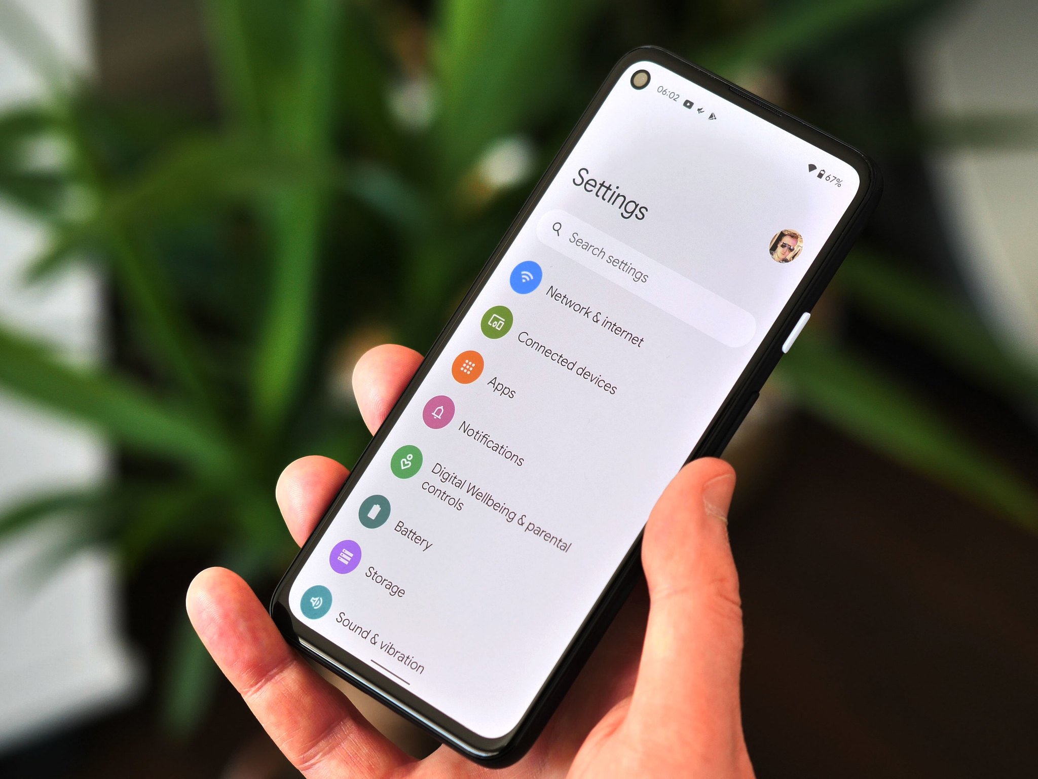
Adding in the weird app splash effect and the new minimize animation (though that one is kind of cool on its own) and the extra spacing and the ginormous controls, you have the Pixel's bland but efficient software with some extra effects tacked in place on top of it. And I definitely do not dig it.
Android has no default "look" because phone makers can do what they want with the UI.
But it's not all bad news because when it comes to the very best Android phones, manufacturers like Samsung are going to take the basics Google has added — like splash loading animations — and turn them into something that will fit in a little better. That's the beauty of Android as well as one of its faults: companies are free to change most of it when they use it.
We've all seen this. Grab one Android phone and then move to another from a different manufacturer and things are going to look and feel very different. Sometimes we love the "skins" manufacturers put on top of Android's base. Other times, we don't love it so much. But it's been there since the beginning (well, almost) and it's not going to change.
These changes are often more than skin deep, though, and that's where things can cause a problem. When a company like Samsung or Xiaomi takes the code that Google offers and then tries to change how everything looks, it affects more than just the colors and animations. Google doesn't use Android as written, either, though it does generally keep everything in its original place when it comes to settings and menus and shortcuts.
Companies like Samsung are really good when it comes to building a cohesive interface.
Some folks think this is a bad thing, and when it used to take Samsung a year or more to make these changes to the newest version of Android, it was hard to argue. Nowadays, though, companies that make our phones have their teams in place, and waiting for even simple updates is mostly a thing of the past. Unless you bought a Motorola phone, anyways.
There are times when it's a good thing, too. If you're not a fan of what you've seen from Android 12 in the UI department, this is one of those times. Samsung will include splash animations and fancy new ways to bounce around, but it will take time to blend this new eye candy into something that fits well with Samsung's One UI. Even companies like OnePlus who keep the software on their phones fairly close to basic Android will do a little more with what Google offers here.
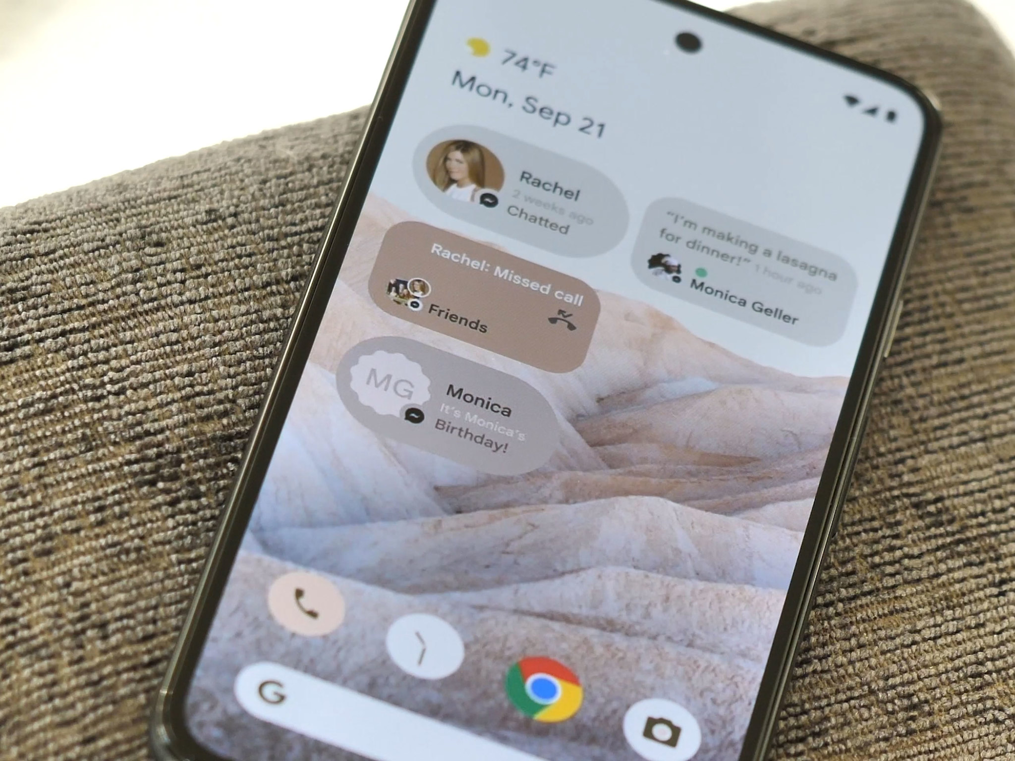
What makes Android phones different is also what makes Android great.
As I mentioned, this is what makes Android different and great. Instead of a one-size-fits-all approach, we have plenty of choices when it comes to the software on our smartphones. There is the minimalism of the Pixel (complete with bouncy bounces and uber wide volume controls) or the over-the-top look and feel we see from Xiaomi. Even Huawei, which doesn't make Google-based Android phones any longer, can take the same base code and Huawei-ify it to its heart's content.
I still love what I see in Android 12 and think it's going to bring some great changes like how we chat with friends and how we can better manage our privacy. I'll even get used to what the Pixel team has done with the user interface, eventually. But I have a feeling we're going to see Samsung do it better.
24/04/2021 11:30 AM
Our top 5 Android and iOS apps of the week (3)
24/04/2021 06:00 PM
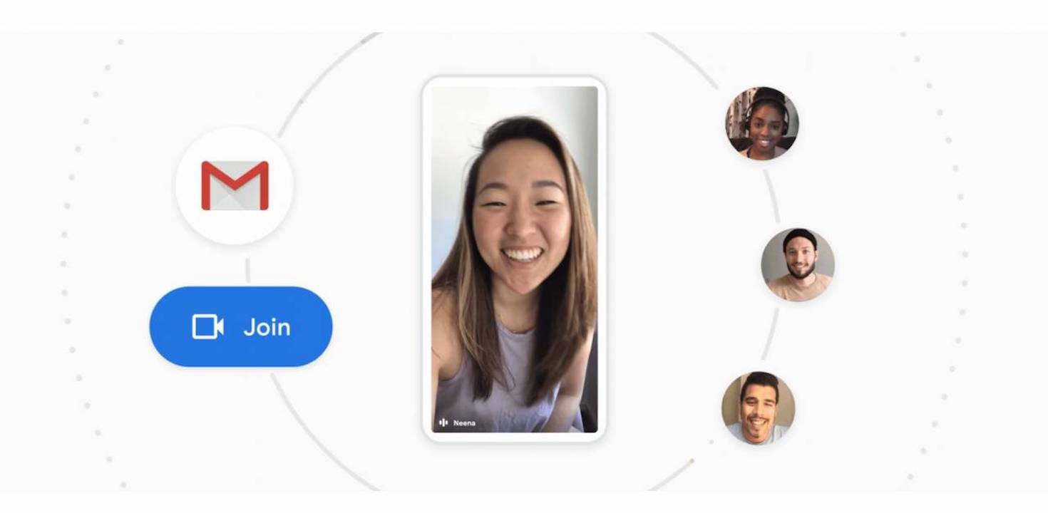
Google Meet brings data saver which can also save battery, CPU
24/04/2021 02:07 PM
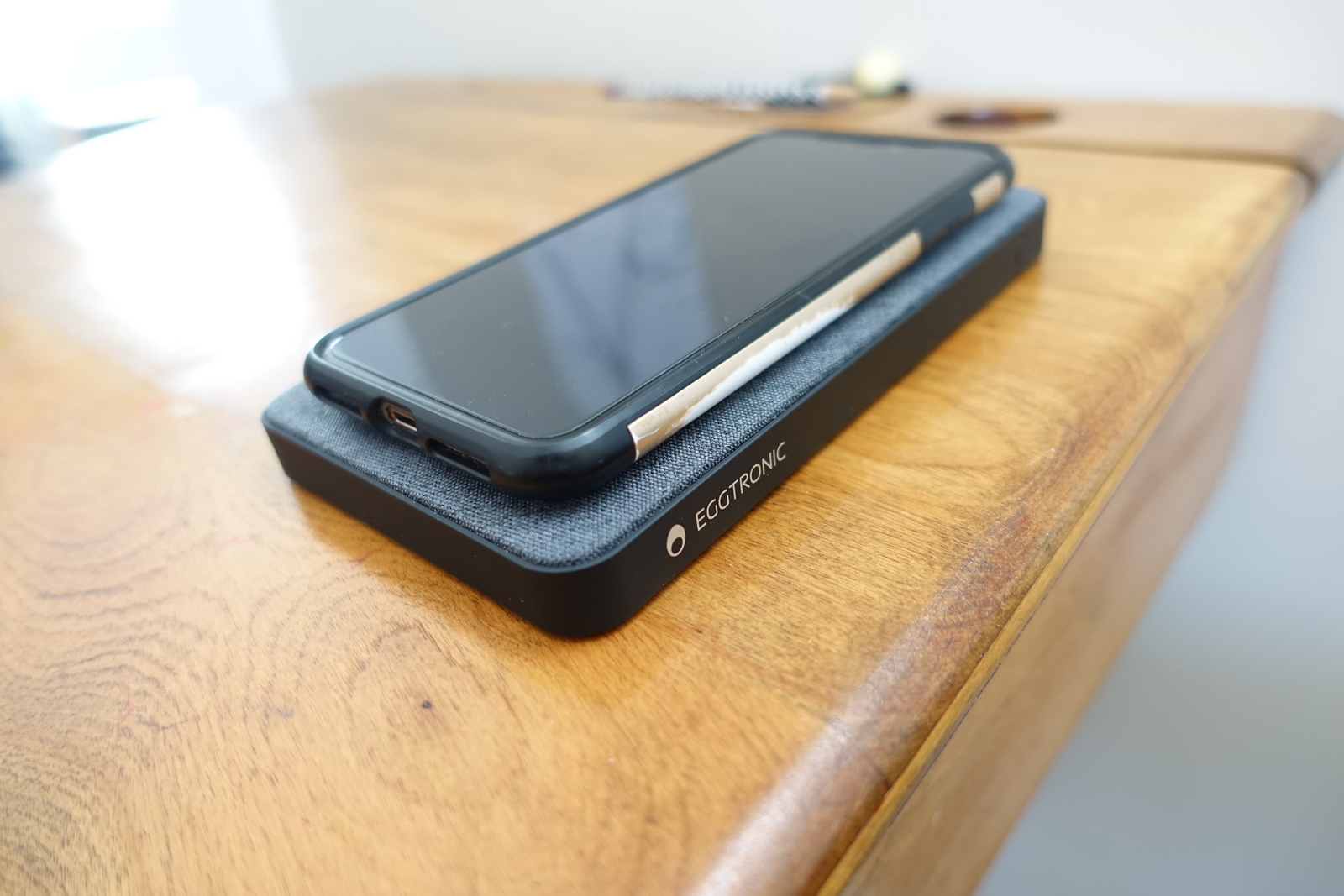
Einova 63W Laptop Power Bank Review
24/04/2021 02:14 PM
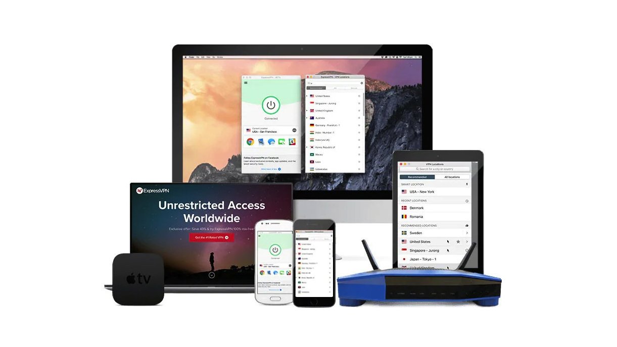
Best Google Chrome VPN and extensions 2021
24/04/2021 07:00 AM
The Pentagon gave a company control of 175 million IP addresses
24/04/2021 10:02 PM
Elon Musk will host 'Saturday Night Live' on May 8th
24/04/2021 10:29 PM
Fujifilm releases special app for instax mini Link for Nintendo Switch
24/04/2021 10:43 AM
- Comics
- HEALTH
- Libraries & Demo
- Sports Games
- Racing
- Cards & Casino
- Media & Video
- Photography
- Transportation
- Arcade & Action
- Brain & Puzzle
- Social
- Communication
- Casual
- Personalization
- Tools
- Medical
- Weather
- Shopping
- Health & Fitness
- Productivity
- Books & Reference
- Finance
- Entertainment
- Business
- Sports
- Music & Audio
- News & Magazines
- Education
- Lifestyle
- Travel & Local
