YouTube is trying to fix the comment section again but can't figure out how - Android
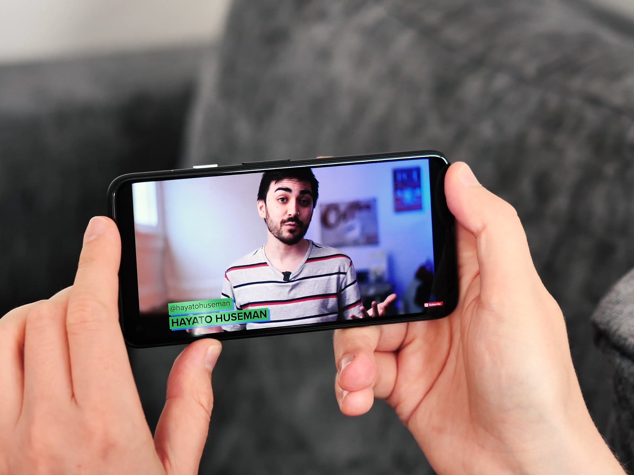
YouTube is having a bit of a crisis with its comment section.
What you need to know
- YouTube is reportedly testing out new layouts for the comment section.
- Several versions have been spotted so far, suggesting YouTube is trying out different ways.
- Tests are apparently only rolling out for a small group of users.
YouTube confused many when it changed up the positioning of its comment section last year. For a while, the app had reminders letting people know that the comment section had moved to a sliver of sectioning between the main video and the suggested video. Arguably, it makes more sense and keeps users from scrolling through possible spoilers for the best PS5 games or something before viewing or adding their own comments. Now it seems YouTube is looking to change comments again while making them more accessible.
Spotted by Android Police, there seem to be different variants of the new comment section, suggesting YouTube is testing out each one to see what sticks.
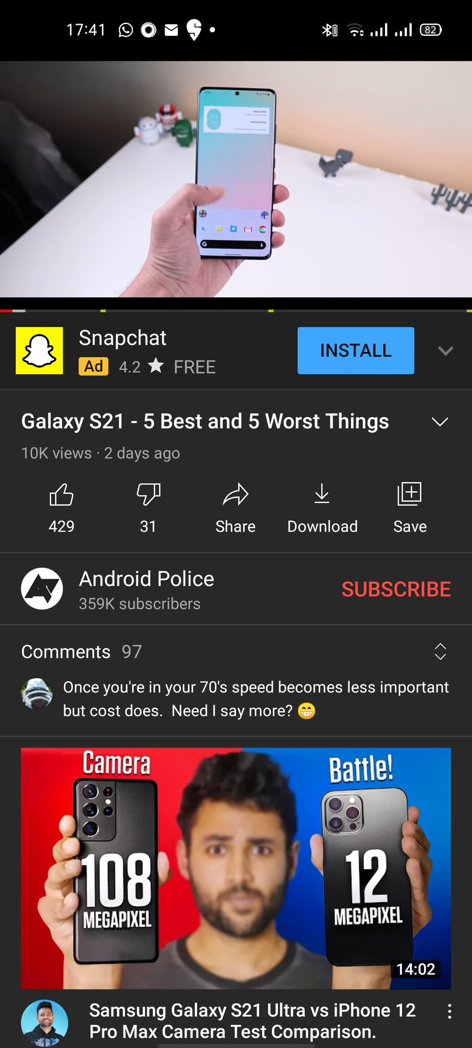
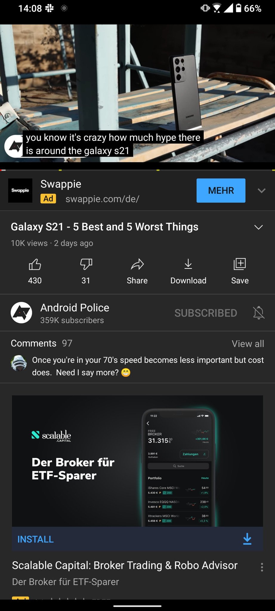
The first image is the original version, which appears for most users now. The second image change is subtle, but you'll notice that the expand icon to the far right has been changed to a "view all" button. The next two versions have a more drastic change.
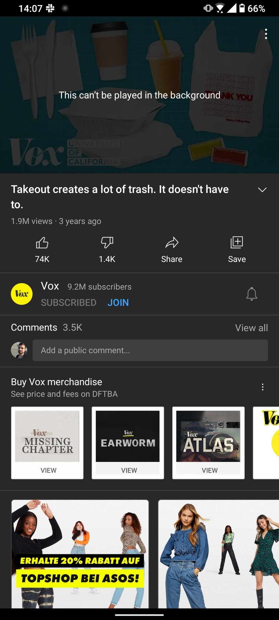
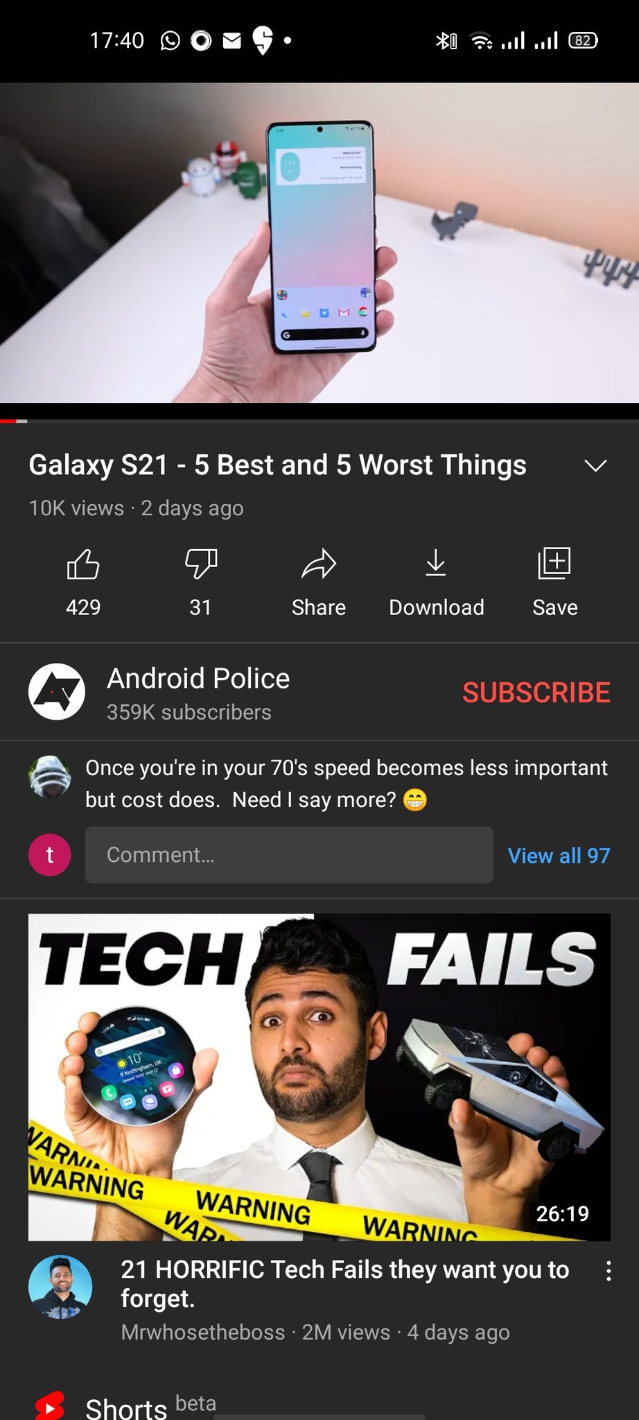
The image on the right shows an easily accessible text field to add a comment but seems to hide any comments from being immediately viewable. In previous versions, at least one comment is shown before expanding. The image on the right appears to address this by keeping the text field and displaying a comment above it. The "view all" button has been squeezed next to the text field and indicates the video's number of comments. This might seem like the best solution to YouTube's crisis, but it's unsure which version the company will go with.
The new comment layouts seem to appear at random via a/b tests, so there's no saying who will get to experience either version. Of course, if you can't be bothered with comments, it might be helpful to know how to use YouTube's incognito mode. Comments won't go away, but at least this way, you won't be able to leave any, and your watch history won't be saved.
05/03/2021 01:09 AM
Google Pixel 5a rumored arrival date leaks — when to expect it
05/03/2021 08:29 PM
Tesla ditches forums and pushes fans to take political action with Engage
05/03/2021 06:41 PM
The RedMagic 6 Series comes with a whopping 165Hz screen
05/03/2021 12:39 PM
Redmi Note 10 Pro review - Revved up specs for a great price
05/03/2021 10:00 AM
Easy steps on how to share your location using WhatsApp
05/03/2021 10:00 PM
OPPO beats out Apple for the top spot in China amid Huawei's US drama
05/03/2021 06:14 PM
Samsung Galaxy XCover 5 rugged phone officially announced
05/03/2021 03:30 AM
- Comics
- HEALTH
- Libraries & Demo
- Sports Games
- Racing
- Cards & Casino
- Media & Video
- Photography
- Transportation
- Arcade & Action
- Brain & Puzzle
- Social
- Communication
- Casual
- Personalization
- Tools
- Medical
- Weather
- Shopping
- Health & Fitness
- Productivity
- Books & Reference
- Finance
- Entertainment
- Business
- Sports
- Music & Audio
- News & Magazines
- Education
- Lifestyle
- Travel & Local


