Android 12 Developer Preview 3 Brings Storage, Battery UI Rework - Android
Google is rolling out Android 12 Developer Preview 3 and it’s made significant changes to battery and storage UI. That’s based on a recent report from 9to5Google, detailing what’s changed in the Settings menu. Specifically, these changes are being made to the Battery and Storage segments of the Settings app. Users can reach the menus [...]
Read More...
The post Android 12 Developer Preview 3 Brings Storage, Battery UI Rework appeared first on Android Headlines.

Google is rolling out Android 12 Developer Preview 3 and it’s made significant changes to battery and storage UI. That’s based on a recent report from 9to5Google, detailing what’s changed in the Settings menu.
Specifically, these changes are being made to the Battery and Storage segments of the Settings app. Users can reach the menus through that app or directly via a long-press or single press in the Quick Settings tiles in the notification shade. Typically, those have shown icons or circular progress bars. As well as a few other options, depending on which of the two is visited. Now, those are getting a refresh.
What’s changed for battery and storage settings in Android 12?
The biggest alteration in either the battery or storage settings UI in this version of Android 12 is the introduction of progress bars. Prior to the change, Storage showed a circle-shaped bar with the percentage used in the middle. In addition to a readout of how many of the handset’s GB have been used.
Now, only the latter information is detailed and elements associated with storage management have been shifted down-page. Instead, a progress bar is shown, with numbers indicating storage used and storage remaining. Just above that, there’s a new drop-down menu. In the shared images, that box is set to “Internal shared storage.” So it may be safe to assume that SD cards and other storage will have their own UI. With users selecting from that drop-down box.
A near-identical refresh has taken place over on the battery side of things. The Battery UI’s previously-used battery icon has been replaced with a progress bar. And that’s accompanied by a percentage and estimated time remaining. Other, interactive management options are shifted down the page, similar to how Samsung’s One UI is arranged.
When will this arrive for everybody with Android 12?
Of course, this initial rollout of Android 12 is only intended for developers to test their own apps. But this is the third and final developer preview variant of the incoming OS too. In May, the company is slated to start public beta testing for those who want to try it out early and have compatible devices.
Regardless, the final release will arrive sometime after August if Google sticks to its schedule. So users should start seeing the new UI, if their preferred OEM uses it, sometime after that.
 Android’s storage and battery UI, shown with the current version on the left and Android 12 Developer Preview 3 on the right
The post Android 12 Developer Preview 3 Brings Storage, Battery UI Rework appeared first on Android Headlines.
21/04/2021 11:19 PM
How does the Huawei Mate X2 stack up against the Galaxy Z Fold 2
21/04/2021 11:35 PM
Android 12's settings redesign is prettier but less useful
21/04/2021 10:08 PM
OnePlus Watch is getting an always-on display after abysmal reviews
21/04/2021 07:15 PM
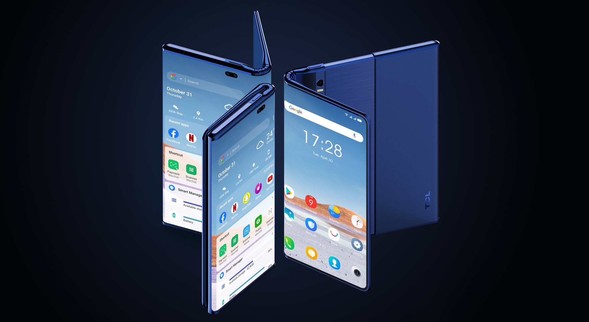
TCL's Fold 'n' Roll concept phone looks equal parts crazy and cool
21/04/2021 01:30 PM
Android 12 screenshot markup tool now features fancy fonts
21/04/2021 09:55 PM
- Comics
- HEALTH
- Libraries & Demo
- Sports Games
- Racing
- Cards & Casino
- Media & Video
- Photography
- Transportation
- Arcade & Action
- Brain & Puzzle
- Social
- Communication
- Casual
- Personalization
- Tools
- Medical
- Weather
- Shopping
- Health & Fitness
- Productivity
- Books & Reference
- Finance
- Entertainment
- Business
- Sports
- Music & Audio
- News & Magazines
- Education
- Lifestyle
- Travel & Local


