Android 12's settings redesign is prettier but less useful - Android

In Google's brand-new Developer Preview 3 release of Android 12, the Settings menu looks a little different. Compared to both Android 11 and A12 DP2, the updated version is prettier and less dense, but does away with the subheadings to make it a little less clear where various options are. It also gets some new "bouncy" animations when scrolling. It's the new look for the Settings menu, previously hidden behind an ADB command and labelled "silky home."
Read MoreAndroid 12's settings redesign is prettier but less useful was written by the awesome team at Android Police.
21/04/2021 10:08 PM
Here's When The Roborock S7 Will Be Back In Stock
21/04/2021 04:25 PM
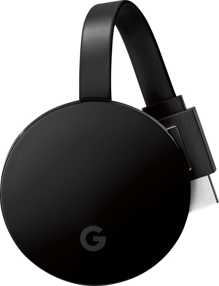
Are Chromecasts without Google TV still worth buying
21/04/2021 08:00 PM
Google Search lets you play around with AR iconic Japanese characters
21/04/2021 01:48 AM
Microsoft's Cloud-Based PC Service May Launch This Summer
21/04/2021 11:34 AM
McAfee identified eight malicious apps you must uninstall right away
21/04/2021 06:19 PM
Google App My Actions Feature Gives Easier Access To Custom Shortcuts
21/04/2021 08:19 PM
Get Samsung's best earbuds for almost half off by going refurbished
21/04/2021 07:00 PM
- Comics
- HEALTH
- Libraries & Demo
- Sports Games
- Racing
- Cards & Casino
- Media & Video
- Photography
- Transportation
- Arcade & Action
- Brain & Puzzle
- Social
- Communication
- Casual
- Personalization
- Tools
- Medical
- Weather
- Shopping
- Health & Fitness
- Productivity
- Books & Reference
- Finance
- Entertainment
- Business
- Sports
- Music & Audio
- News & Magazines
- Education
- Lifestyle
- Travel & Local


