Android 12 Developer Preview 3 hands-on - Verified links to the rescue - Android
We're nearly on stable ground.
The final Android 12 Developer Preview has arrived, and that means we're just a few short weeks away from the first public beta, the next major milestone towards stable Android 12. In this version, we're starting to see more of the visual changes and animations that we know are coming in the next version, giving us a closer look at what the final build might look like.
I disregarded my own advice and installed the latest Developer Preview 3 build on my personal Pixel 5, as I've done with the previous builds, in order to break down some of the biggest user-facing changes in this new software release.
As a reminder, you probably shouldn't install this or any other preview build on your personal phone — that especially goes for anyone on an older device like the Pixel 4, not because it's not one of the best Android phones around anymore, but because stability seems to be significantly worse on older models. For what it's worth, things have been mostly fine on my Pixel 5 so far.
Jump to:
- Aesthetic changes
- Search bar in widget selector screen
- Refreshed screenshot tools
- Improved accessibility mode
- Improved default link behavior
- More prominent counter for grouped notifications
Aesthetic changes

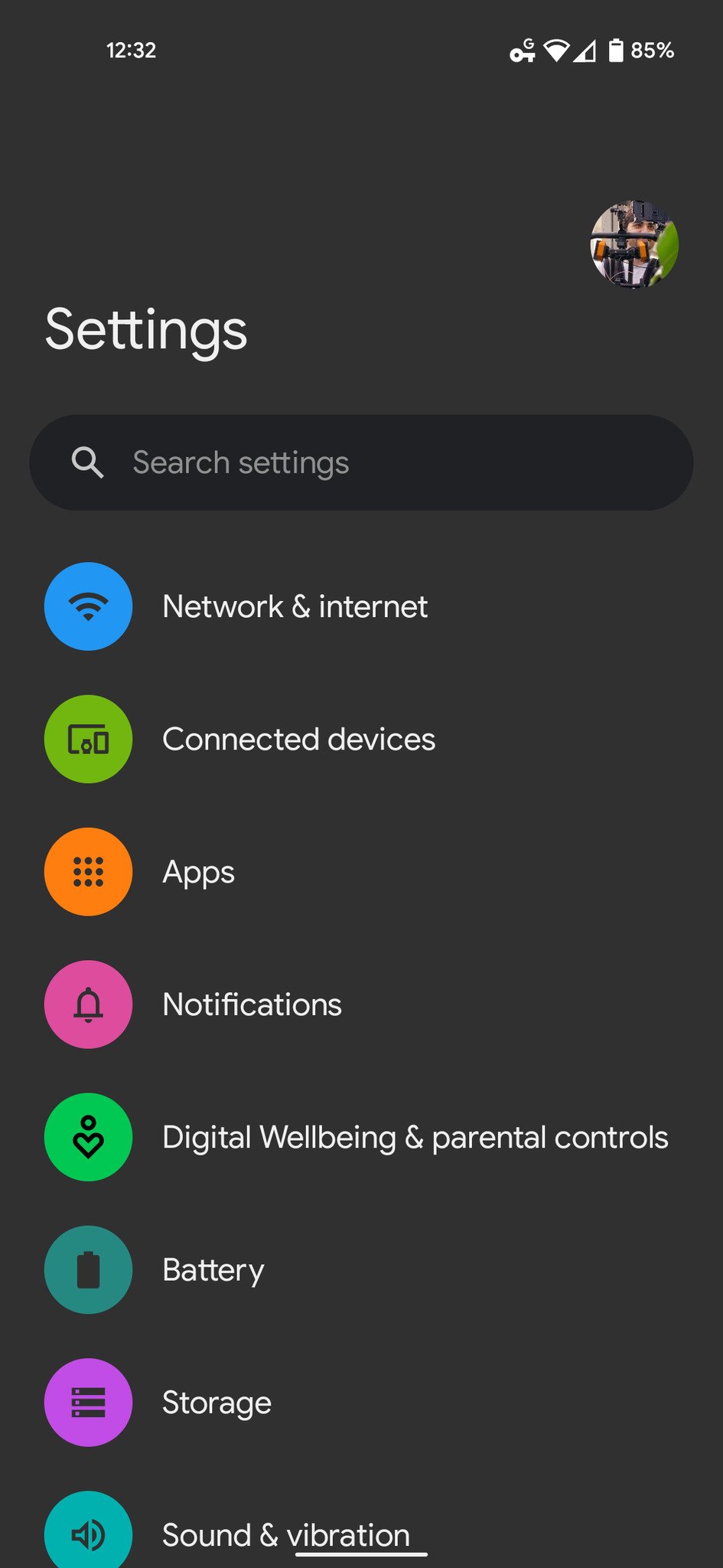
As soon as you boot Developer Preview 3 for the first time, you'll start to notice some visual distinctions from the previous builds we've tested. One of the biggest changes is the Settings app, which now defaults to the "Silky Home" layout we saw in previous builds without the need for toggling hidden feature flags through ADB.
If you've already been using Silky Home on the Developer Preview builds, this doesn't look terribly new, save for a few small refinements. As you're scrolling through the menu items, you'll quickly notice the other big visual change in DP3: the bouncy new overscroll animation when reaching the end of a list. It works in nearly every app already, including social media apps like Twitter and Instagram; as you reach the end of a list, the menu items dynamically "bounce" up with varying elasticity, depending on how quickly you were scrolling.
I'm personally not a fan of this look, at least in its current state, but it definitely makes Android 12 feel a bit more lively and animated.
Various UI elements are also much rounder in Android 12 DP3. Cards in the Recents Apps screen have significantly more rounded corners than before, and the redesigned slider layout when adjusting the volume up or down is bigger and rounder compared to DP2. Funny enough, despite the volume slider and audio profile toggle getting rounded out, the Live Captions toggle remains a rounded square.
There are other small visual changes to the UI, including a slightly thicker font used in the At a Glance widget on the home screen and a new splash screen when launching apps that now reflects your preference for light or dark themes and can even borrow from the background color of an app icon if available, making for a more cohesive overall feel.
Search bar in widget selector screen


In Developer Preview 2, we saw Google revamp the widget selector screen, accessed by long-pressing a blank space on the home screen. The newly alphabetized and vertically scrolling list of widgets is far easier to navigate than in previous versions of Android, and with DP3, it's even easier to find specific widgets thanks to the addition of a search bar at the top of the list.
Of course, you can search for the name of an app to pull up all of its accompanying widgets, but this search bar can even parse the names of the individual widgets themselves. For example, searching for "data" can instantly find the Data Usage Widget from the Google Fi app.
Refreshed screenshot tools
When taking a screenshot in DP3, you can now swipe the preview image away from either direction, rather than just left like in Developer Preview 2. This isn't a terribly significant change, but with how many times I've tried swiping them to the right in DP2, it's a welcome change as far as I'm concerned.
In addition, the Markup tool for annotating screenshots has been updated with new fonts, totaling up to 5, though we're still missing scrolling screenshots — at least, without digging into feature flags.
Improved accessibility mode
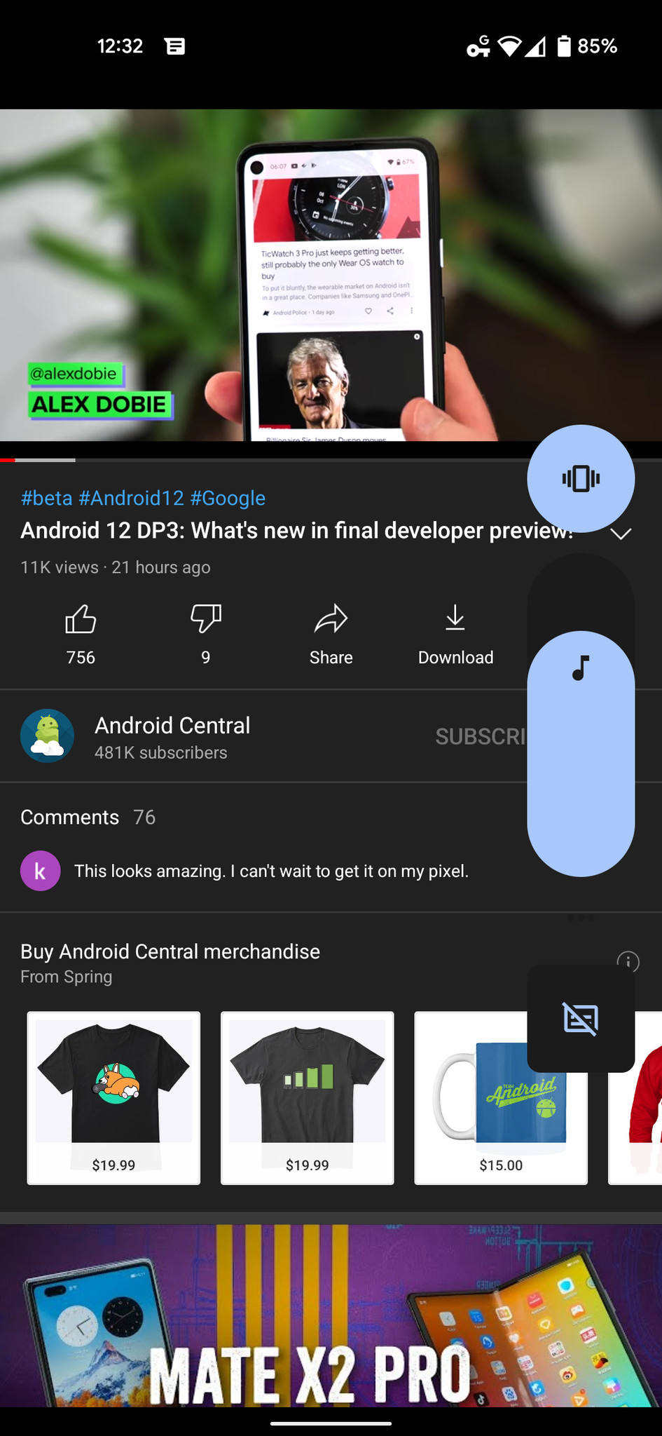
A huge benefit of the Android 12 Developer Preview builds has been improvements to accessibility features, including a new floating shortcut bubble that takes the place of the previous two-finger swipe shortcut. You can reposition the new accessibility button to anywhere you'd like along the edges of the screen, then tap it at any time to open a menu of large shortcuts, including Google Assistant, volume up and down, brightness up and down, and the power menu.
You can adjust the size of this floating bubble from your phone's accessibility settings menu or set it to fade when not in use, with a slider to adjust the transparency levels.
Improved default link behavior

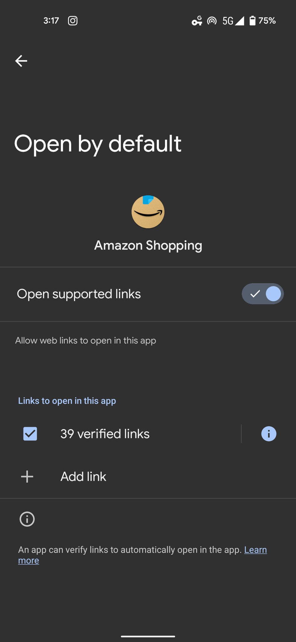

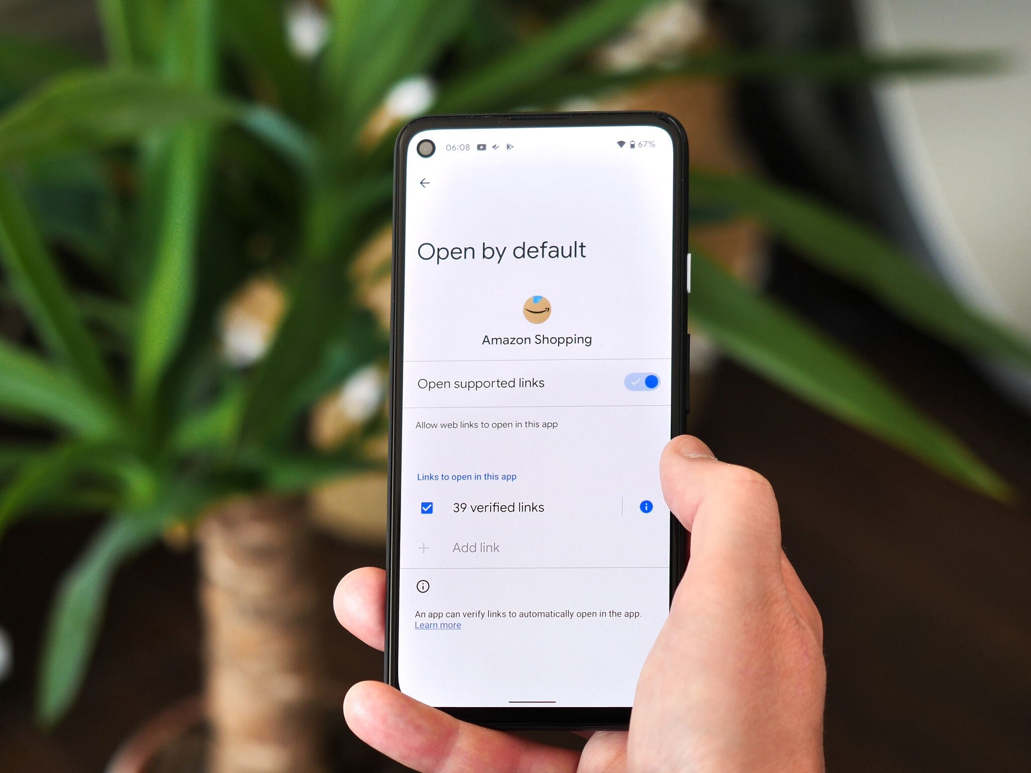
There are few things as annoying when setting up a new Android phone than the constant dialog boxes when tapping a link, asking which app you'd like to open the link with. In Android 12 DP3, Google tackles this nuisance with new default link behavior that assigns particular apps to open "verified links" from trusted sites automatically. This new behavior replaces the "Open supported links" setting from DP2. While you'll presumably be able to add your own verified links eventually, the option is still grayed out within the settings for now.
More prominent counter for grouped notifications
Android 12's notification management system has seen a number of revisions in the Developer Preview builds, and in DP3, they've made the counter for grouped notifications more prominent, now integrated with the expansion arrow in the upper righthand corner of a notification group and matched to your system accent color.
This isn't a particularly huge overhaul, but it certainly helps improve visibility in certain situations. In DP2, the notification counter text was colored based on the corresponding app icon, which often lacked cohesion and proper contrast with the rest of the UI. This is a nice, subtle step towards a more consistent look.
23/04/2021 08:08 PM
ASUS ZenFone 8 teased with 'compact' size and mid-May launch
23/04/2021 08:46 PM
Blanket Your Home in WiFi With The Google WiFi 3-Pack For $159
23/04/2021 03:08 PM
Connect a Chromebook to a TV
23/04/2021 03:00 PM
Montblanc Summit Lite smartwatch rolls out in the US
23/04/2021 09:00 AM
Honda aims to shift car sales entirely to EVs by 2040
23/04/2021 08:32 PM
The Roborock S7 Is Back In Stock!
23/04/2021 02:55 PM
Xiaomi Mi MIX Fold Coming To Global Markets Soon
23/04/2021 12:15 PM
- Comics
- HEALTH
- Libraries & Demo
- Sports Games
- Racing
- Cards & Casino
- Media & Video
- Photography
- Transportation
- Arcade & Action
- Brain & Puzzle
- Social
- Communication
- Casual
- Personalization
- Tools
- Medical
- Weather
- Shopping
- Health & Fitness
- Productivity
- Books & Reference
- Finance
- Entertainment
- Business
- Sports
- Music & Audio
- News & Magazines
- Education
- Lifestyle
- Travel & Local
![[Deal] Save $50 on Jabra’s Elite 85t Wireless Earbuds with ANC and HearThough technology](http://www.android.co.rs/data/newsimages/googleandroidphone4.jpg)

