iOS 14 may look great, but Android launchers still put it to shame - Android
Activating launchers, theme packs, and widgets felt as transformative as the world turning to color in Pleasantville.

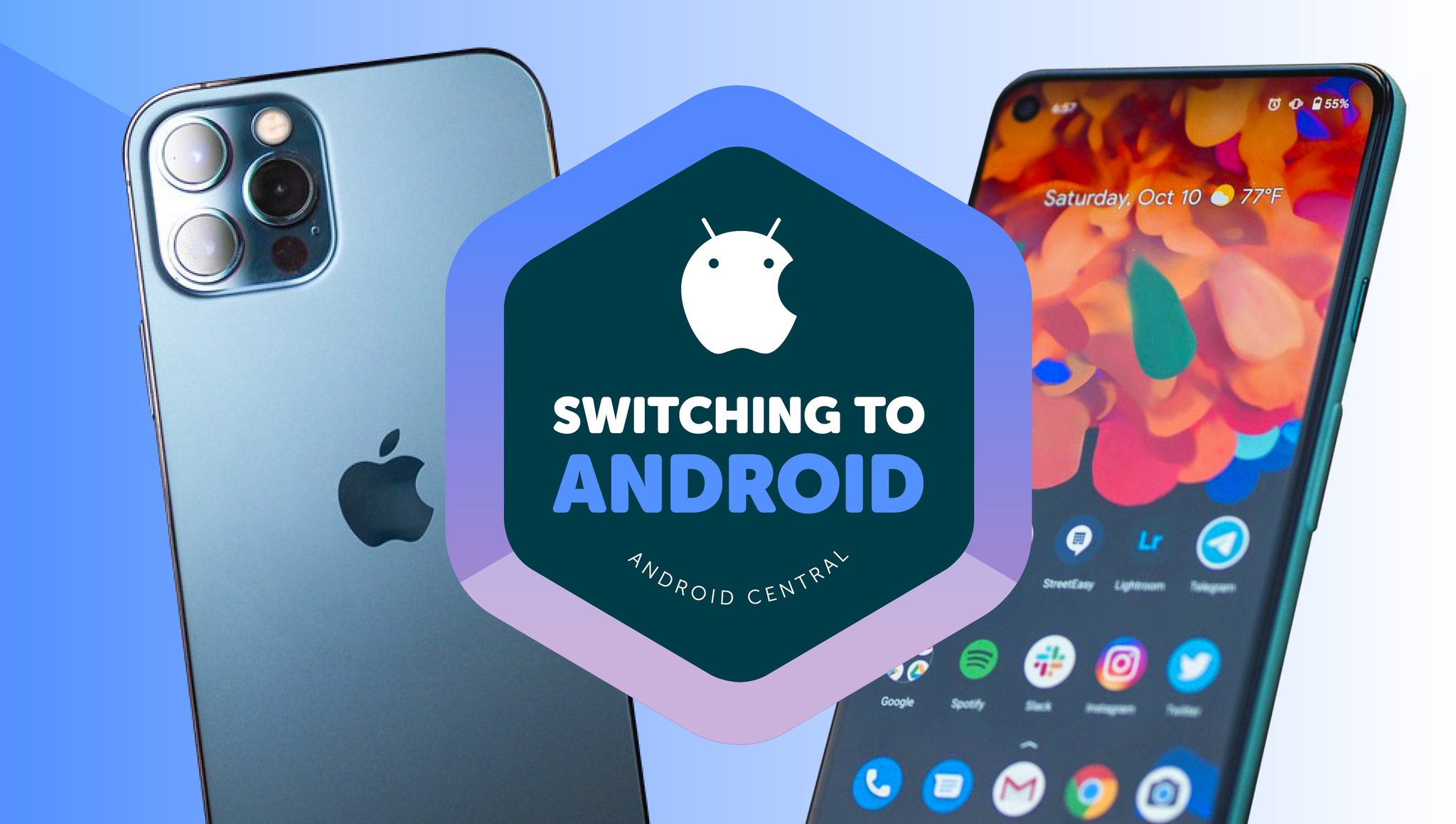
As part of my Switching to Android journey, I'm documenting the differences between the two operating systems, exploring the Android features that you might take for granted, but that iOS users may find a compelling reason to switch sides.
My first couple of days with Android 11 and One UI 3.1 underwhelmed me. I successfully transferred my compatible iOS apps over, and there they sat as plain little circles or rounded squares, crowded in on one another. In particular, my Pixel 3a icons looked insubstantial, the display so cramped that several app names ended in ellipses (i.e., Google P...). Bad aesthetics didn't exactly make me enthusiastic about the transition.
Before iOS 14, iPhone users happily lived with the same aesthetics and similar UI for years. They may care more about Apple apps than customization.
For regular Android users this is a trivial issue: just reconfigure your settings to make the apps more accessible or prettier, right? You'd be surprised how many longtime iPhone users, myself included, aren't used to changing anything more drastic than the wallpaper. Apple designs may have followed the "think different" motto in the past; but most Apple users fully expect their hardware and software to retain a particular style for years at a time with only incremental changes. Customization was a foreign concept before iOS 14.
When Apple's new OS, App Library, and widgets came out, my future colleagues argued that iOS 14 was a better version of Android 11. I can only speak to the Apple side of things, but I personally wasn't quite as impressed. Yes, the widgets are especially handy and a huge step up for Apple's UI. Yet the App Library relies on the same folders as before, just auto-organized. To me, iOS folders are like garages stuffed with stacks of old tools you hold onto and use once in a blue moon — not where you keep the daily apps you actually need. Besides that, the apps themselves are still their usual square selves.
I was open to a new experience, even if I was used to Apple's style. Then I found out about Android launchers: Android theming had been almost completely off my radar until that moment, and every friend with an iPhone I asked didn't know it was an option either.
I fell eagerly down a rabbit hole of launchers, icon packs, and custom KWGT widgets, tools that made playing with phone settings appealing instead of a chore. Customization is undoubtedly one of the high points for Google in the iOS vs Android battle.
Launching my creative side
![]()
As an easy starting point, I looked through AC's best Android launchers list and applied them one by one to my home screen. My immediate, unexpected favorite was Microsoft Launcher, thanks in part to its multi-level dock but mostly because of its scrollable widgets page. Being able to scroll through previews of all my favorite apps, instead of having to swipe through different pages or open and load multiple apps, is a genuinely cool feature that I only wish Apple and Google would copy.
With other launchers, it was a mixed bag as a new user. I'm certain that Nova Launcher and Action Launcher are some of the most popular tools for a reason, but they both can be overwhelming for an iOS user that's still figuring out which way to swipe to open a menu, or how to even find the elusive App drawer! I found myself preferring launchers like Niagara Launcher that have an immediate impact without much user setup. Yes, I know that's my casual iOS self talking, but I'm trying to ease into things!
Android users probably take launchers and icon packs as a given, but they're a revelation for a formerly complacent iPhone user.
Android icon packs are also something that you likely take for granted, but were a huge gust of fresh air for me. There may be iOS icon packs now, but they're mostly so expensive that you can't easily switch between different packs based on your mood. I'm currently on a minimalist kick with Whicons, but I switch to Crayon Icon, Mellow Dark, or a couple other fun options depending on which wallpaper I'm using.
I also downloaded KWGT presets through KWGT Pro. I'd read about talented Apple fans who'd created iOS 14-style KWGT widgets, and while I personally can just keep using my iPhone if I wanted that, I was very intrigued by the idea of creating custom widgets. I have some coding and design background that I thought could be put to good use, and wanted to try pulling information from apps like Goodreads that didn't have official widgets.
I didn't fully understand that KWGT mostly limits you to design customization, allowing you to use specific tools and info like music players, time and date, or phone battery life. It's possible that I just don't have the developer know-how I need yet to pull off my dream of a Goodreads reading challenge widget. As far as I know, these mostly seem to cater to artistic types that want their widgets to be more uniquely colorful rather than smarter.
Most Android users will just take what other people have built rather than spend time creating something just for the looks. And outliers like me aside, most Apple users probably don't care about customization, and just want a phone that handles all the necessities for them.
Prioritizing style or substance

When iOS 14 launched with its new organizational system and home screen widgets, it inspired plenty of hot takes. One that riled up the AC commenters was the idea that iOS 14 widgets make Android's look like an absolute embarrassment. It's safe to say that I spent more time playing with widget colors and app themes because I don't exactly know yet where they should be, or how much they've changed. But based on my fresh perspective, there are a few annoyances to point out amidst an overall positive experience:
- Is there really not a Google Photos widget yet for Android? It's one of my favorites on my iPhone, so the absence here seems absurd.
- It's very frustrating to me that Android doesn't shove app icons into the next window if you try to add a widget and there isn't enough room. I don't like having to individually drag enough apps away to make room.
- It's generally far easier in Samsung One UI 3.1 to tell that you're currently using a launcher, and to tap the bottom square button to find your way back to One UI Home. On the Pixel, it was tricky to find the settings, and I'm still not entirely sure how to turn it off without a guide.
Those points aside, I generally think that Android launchers and customization got me enthusiastic for Android phones in a way that benefits like a fingerprint reader didn't. It's possible my enthusiasm will fade: Joe Maring argued last year that a simple home screen is better than one with widgets and cute icons. But I plan on playing with icons and widgets until I figure out what I like, instead of just letting Apple deciding for me what I should like!
25/02/2021 11:30 AM
See 'Solar Ash' in action for the first time in a PS5 gameplay video
25/02/2021 06:58 PM
Google finally addresses plans to fix 'Hey Google' on Wear OS
25/02/2021 05:52 PM
Wireless DeX for PC now works with Galaxy devices running One UI 3.1
25/02/2021 06:14 PM
Android 12 to bring Pixel-exclusive lock screen clocks
25/02/2021 02:55 PM
Xiaomi's new Redmi K40 Pro is a Galaxy S21 rival that costs less than $450
25/02/2021 03:27 PM
Ring unveils the Video Doorbell Pro 2, its most advanced smart doorbell
25/02/2021 10:43 AM
Target will open mini Apple stores to attract post-pandemic shoppers
25/02/2021 09:11 AM
OPPO X 2021 rollable prototype phone showcased once again
25/02/2021 06:15 AM
- Comics
- HEALTH
- Libraries & Demo
- Sports Games
- Racing
- Cards & Casino
- Media & Video
- Photography
- Transportation
- Arcade & Action
- Brain & Puzzle
- Social
- Communication
- Casual
- Personalization
- Tools
- Medical
- Weather
- Shopping
- Health & Fitness
- Productivity
- Books & Reference
- Finance
- Entertainment
- Business
- Sports
- Music & Audio
- News & Magazines
- Education
- Lifestyle
- Travel & Local


