Google Play Store’s latest redesign will leave you scratching your head - Android
We don't like it one bit 

Google only recently redesigned the Play Store, getting rid of the hamburger menu and moving most of its menu entry to the account switcher in the top right corner. But it looks like the company isn't done revamping the distribution service. Over the weekend, screenshots of a revamped "My Apps" section have surfaced, and we don't like it one bit.
Read MoreGoogle Play Store’s latest redesign will leave you scratching your head was written by the awesome team at Android Police.
03/05/2021 12:25 PM
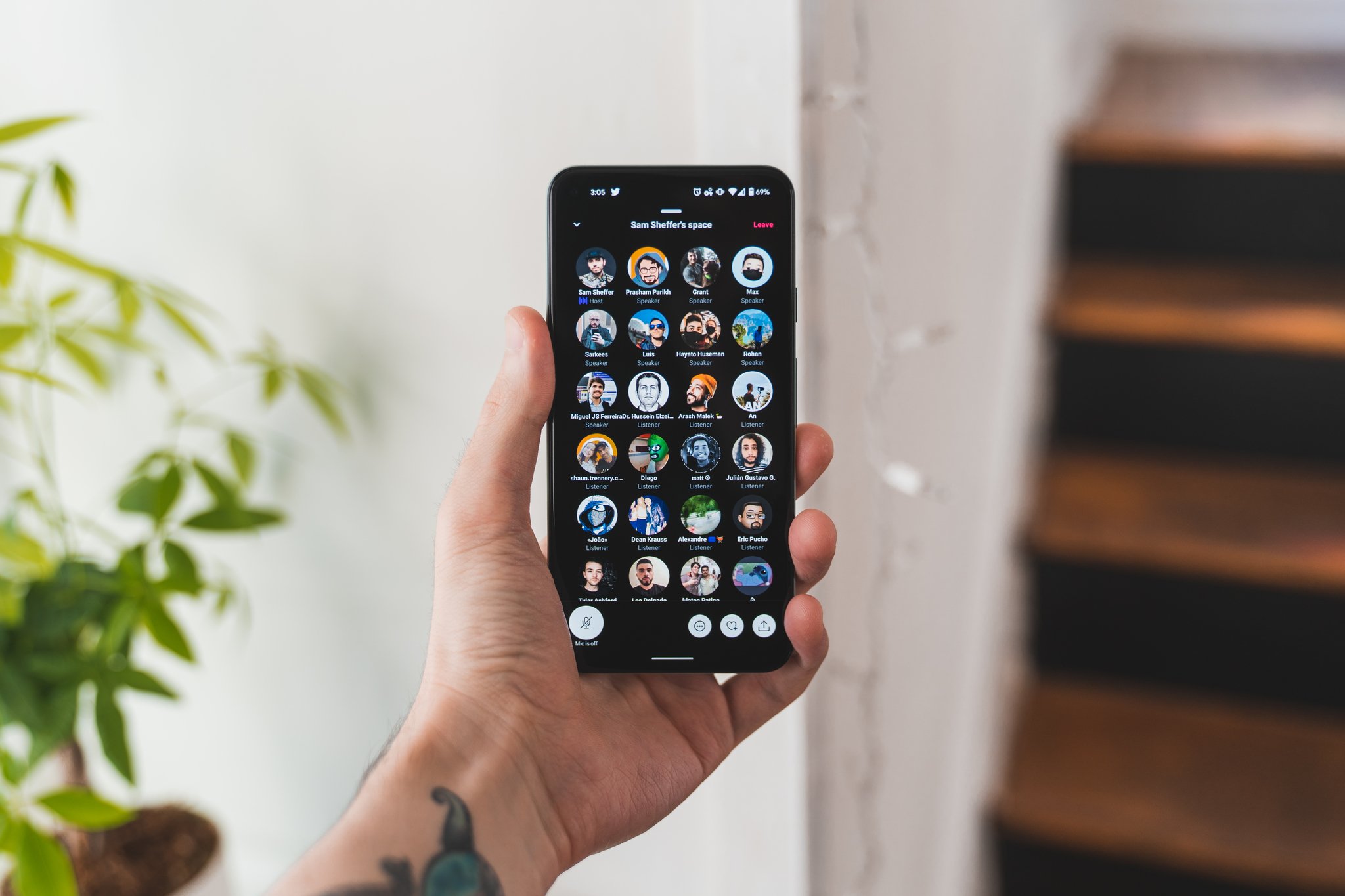
Twitter Spaces is now available to everyone on Android, with one caveat
03/05/2021 06:31 PM
Galaxy Z Fold 3 Charging Speed Revealed
03/05/2021 04:01 PM
Facebook brands Pushbullet as malicious, blocks logins
03/05/2021 10:04 PM
The best gifts for the new grads in your life
03/05/2021 03:26 PM
Organize your thoughts while writing with Scrivener for $30
03/05/2021 04:55 AM
Say Goodbye To WiFi Deadspots With Nest WiFi (2-Pack) For Only $239
03/05/2021 03:35 PM
Google Play Store in India pauses auto-renewals, free trials
03/05/2021 11:00 AM
- Comics
- HEALTH
- Libraries & Demo
- Sports Games
- Racing
- Cards & Casino
- Media & Video
- Photography
- Transportation
- Arcade & Action
- Brain & Puzzle
- Social
- Communication
- Casual
- Personalization
- Tools
- Medical
- Weather
- Shopping
- Health & Fitness
- Productivity
- Books & Reference
- Finance
- Entertainment
- Business
- Sports
- Music & Audio
- News & Magazines
- Education
- Lifestyle
- Travel & Local


