Surprisingly, this Google app is better on iOS than on Android - Android
Chrome is just more user-friendly on iOS.
As a site focused on the best Android phones, Chromebooks, and Google software and services, we don't often consider what life is like on the other side of the OS spectrum. You know who I'm talking about here... the fruit company you love, or hate, or love to hate — Apple. Say what you will about its hardware and software (go on, I know you want to), the simple fact is that, at least in North America, Apple and iOS is a strong competitor to Android. Even though we still see many converts switching from iOS to Android, at least half of our friends and family are likely using iPhones. When we reviewed the iPhone 12 last year, we even called it "the ideal Google phone." Heck, I'll admit it: I frequently use an iPhone myself!
Since I have a lot of recent first-hand experience with iOS, I thought it might be interesting to take a look at the Google apps that I use on both platforms to see which experiences are better on the iPhone. With Apple's penchant for design, I expected that I might like a few more of Google's apps on iOS than Android, but really there was only one app that I felt was demonstrably better there — Google Chrome.
Chrome comparisons
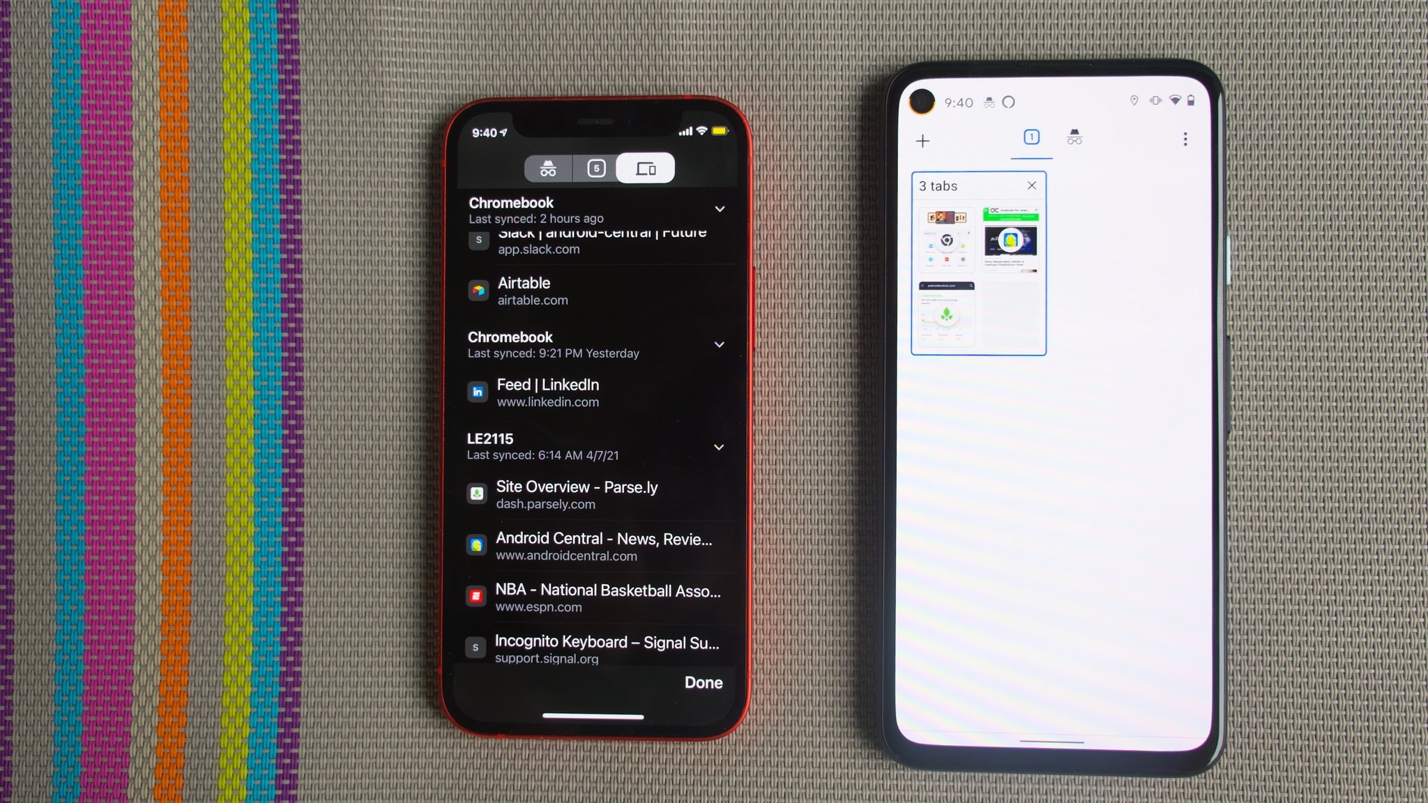
I can already hear you clearing your throat to Android-splain to me with your "well, actuallys" about how Chrome on iOS isn't real Chrome. I realize that it uses Apple's Webkit HTML rendering engine instead of Blink, and thus it is essentially just a re-skinned version of Apple's own Safari browser on the iPhone. I also acknowledge that Apple was way late to the game in allowing iPhone users to set their preferred browser and mail apps as defaults. The iOS app may not be technologically better than the Android version, I get that. But what I'm saying is, I don't really care. I always cringe just a little bit when I move from my iPhone to one of my Android devices (even my beautiful new OnePlus 9) and start using Chrome. Why? There are really only a few reasons, but they all boil down to better usability.
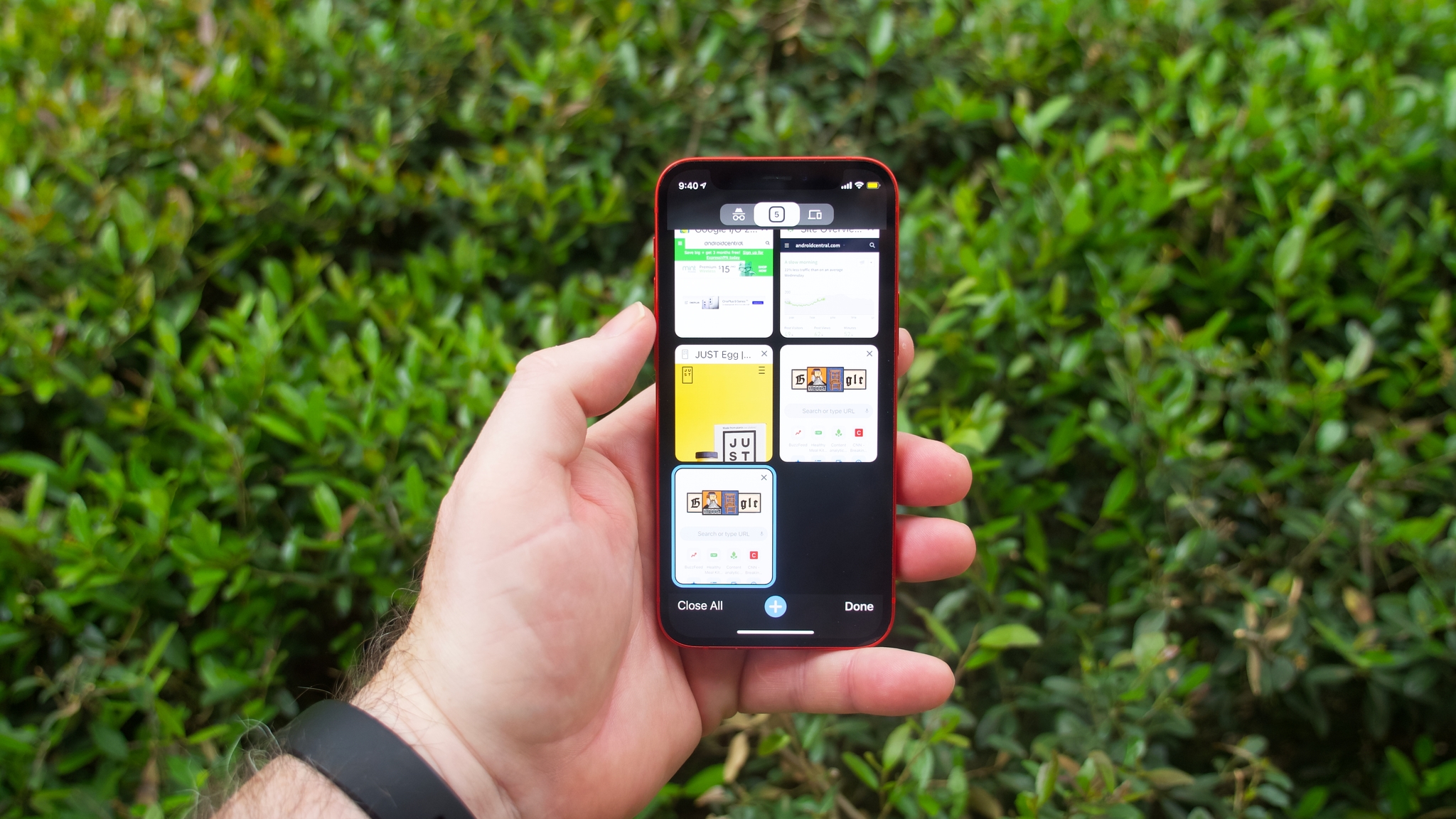
For starters, I am a dinosaur who still prefers to use my phone one-handed. Even on smaller phones like my Pixel 4a or iPhone 12 mini, I find it tedious to reach my thumb to the top corners of the screen to navigate or access various menu options. However, on iOS, that's not an issue with Chrome. All of the main navigation buttons are easily reachable at the bottom of the screen, including the + new tab button, the close all button, and the done/return to tab button. On Android, with the exception of the + new tab button, all of those options are buried in menus at the top left or right of the screen, unless you enable the new Android tab groups and grid view feature (which, apparently, you all hate, judging by the popularity of our how-to guide on turning this feature off). Needless to say, I'm a big fan of this new option on Android!
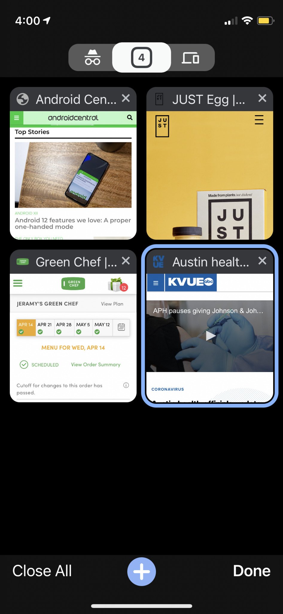
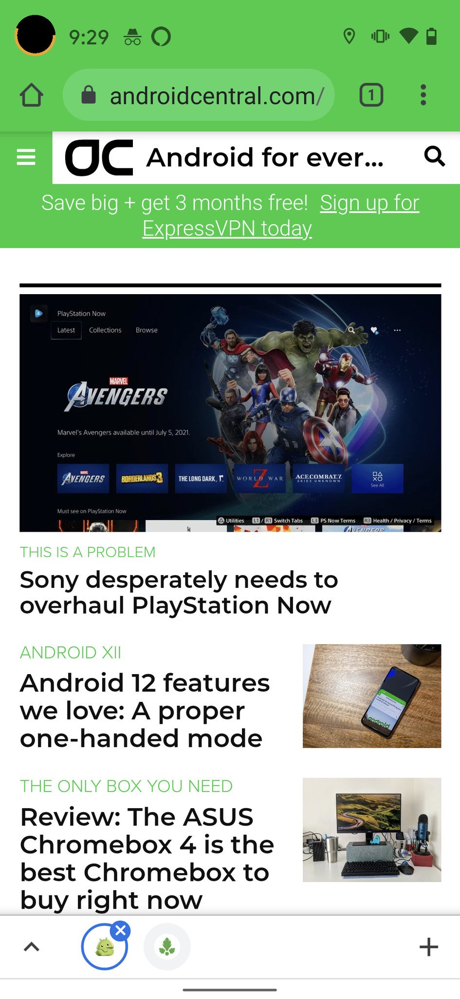
I also find it much easier to navigate through the different Chrome tab groups on iOS. When you zoom out to the grid view of your tabs on an iPhone, it's easy to swipe back and forth between Incognito Mode, on-device tabs, and remote tabs from your other devices, be they other phones, tablets, or computers. To get to these options on Android, you once again have to dive into the menus at the top of the screen. Not optimal for the tired thumbs club.
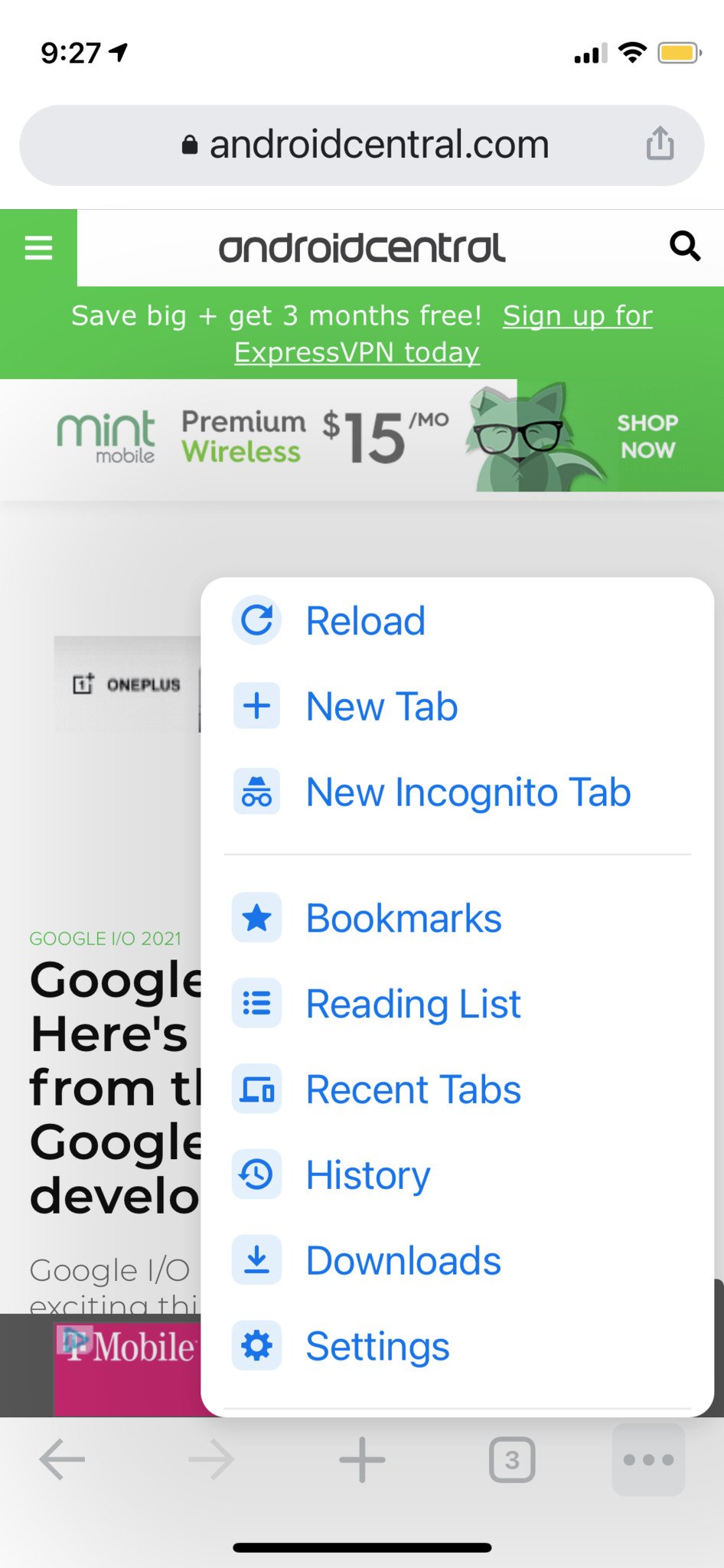
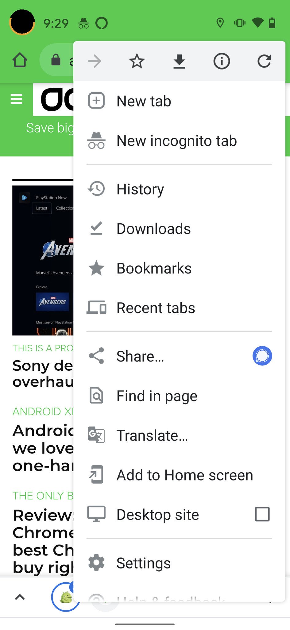
Finally, I have long appreciated the reading list feature on Chrome for iOS, which can be easily accessed one-handed from the three-dot menu at the bottom of the screen. While the reading list is now available on Android as well, it's not switched on by default, and you have to enable it through flags to get it to work. And even then, it's hidden in the bookmarks menu. Where? Say it with me: "At the top of the screen."
While I genuinely enjoy the Google Chrome app experience more on iOS than on Android, and while the Google app experience is remarkably consistent across iOS and between iOS and Android, the simple fact is that most Google apps actually are better on Android — and some markedly so.
What do you think? Am I wrong here? Are there other Google apps that are better on iOS, or are they all just better on Android? Let me know what you think!
15/04/2021 10:30 AM
Samsung's Galaxy M30s and A60 phones are now getting the One UI 3.1 update
15/04/2021 03:26 PM
ADT Sells The Google Nest Mini, Nest Hub, And Nest Hub Max Now
15/04/2021 12:59 AM
Peek Inside Lenovo Legion Duel 2 To See Why It Bends - Video
15/04/2021 11:09 AM
Google rolls out Chrome 90, which defaults to HTTPS instead of HTTP
15/04/2021 05:18 AM
Mint Mobile Buyer’s Guide
15/04/2021 05:00 PM
Galaxy S8, Galaxy A52 5G Start Receiving April Security Patch
15/04/2021 02:11 PM
You can now upgrade to Wi-Fi 6E but should you go with Netgear or ROG
15/04/2021 01:00 PM
Samsung Under Pressure Following Chip Shortage Talks In White House
15/04/2021 01:32 PM
- Comics
- HEALTH
- Libraries & Demo
- Sports Games
- Racing
- Cards & Casino
- Media & Video
- Photography
- Transportation
- Arcade & Action
- Brain & Puzzle
- Social
- Communication
- Casual
- Personalization
- Tools
- Medical
- Weather
- Shopping
- Health & Fitness
- Productivity
- Books & Reference
- Finance
- Entertainment
- Business
- Sports
- Music & Audio
- News & Magazines
- Education
- Lifestyle
- Travel & Local
